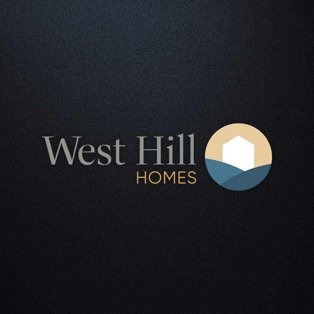
WestHill Homes wanted a logo that reflected their clean, elegant, and sophisticated style. We combined a sleek serif typeface with a bold, minimalist icon to create a timeless, refined mark.
We continued this in the development of business cards, which included a glossy spot varnish on the icon and fine line work.
A darker sign instantly adds an air of sophistication and professionalism, turning a simple patch of grass into a powerful marketing moment. It’s the visual equivalent of a firm handshake: confident, sleek, and impossible to ignore.
WestHill Home’s site communicates quiet confidence and timeless sophistication. It uses clean lines, thoughtful spacing, and a neutral palette to feel both upscale and approachable – perfectly aligned with the promise of delivering elegant, custom homes.
Do you have a project in mind or have any questions about our services? Drop us a line (see what we did there?) and we will get back to you typically within 2 business days!